P1: Media and Rep
Wednesday 26th September
L/O: To develop the language of media analysis
Denotation: Elements that are unarguable; the factual elements.
Connotation: Elements that are arguable; elements that are personal to the viewer.

Large title "TIME"
Listing of what is in the magazine
One large main image to show the main article in the magazine
The red title alerts people when against the white background
Having a white background makes Kanye West stand out
It makes Kanye west seem bigger on the front cover


JAY-Z ALBUM
Denotations:
Black and white
He is holding a cigar and tilting his hat
Connotations:
Isn't a rap album because of what he is wearing on the album. However we know its a rap album because of the parental advisory logo in the bottom corner.
Focuses on his status and wealth by what he is wearing. shows he is successful
Not showing his face could suggest that he wants to keep his modesty like he is shy. Although he shows off his gold ring and cigar
Gangster look
Sophisticated filter (back and white)
The album name 'reasonable doubt'- connotations of the law and criminal activities (contrasts with the images but links to the genre of rap)
Serif font doesn't match rap/hiphop genre

ADELE ALBUM:
Denotations:
SEPIA filter
modern font with album name in a different colour
Uses her age for album names
Uses space well
Connotations:
Modern thin (sans serif) font represents a feminine audience. she reflects her audience
Looks serious which could suggest what her songs are like on the album
Softer SEPIA tones could suggest the softer sounds of her songs
SEIPA tones could suggest age
The red 25 could link to romance which represents what her songs are about
The large photo of her makes it seem intimate which can link to her songs.

KENDRICK LAMAR ALBUM:
Denotations:
Has the parental advisory album
Muted colour palette
Connotations:
Without text the image sticks to a monochrome colour palette especially with what he is wearing. This fits the connotations from the title of the album GOOD KID IN A MAD CITY, as the grime and dirt would probably be found in a 'mad city', so he could have gone for a broken and uncared for theme
Big bold (sans serif) font represents a male audience
The vibe that the album gives off can be linked the the genre of music and target audience
The lack of direct address could suggest shyness or humility
The whole theme of the album links to the genre
Wednesday 3rd October 2018
L/O: To develop the language of media analysis

LOOP TASK:
Denotations:
Stars are above her head
Birds flowers and roses
Soft colours with a bright red on her shirt and album name
Necklace of roses
Two birds on her shoulders
Light yellow background
Necklace of roses
Two birds on her shoulders
Light yellow background
Connotations:
Aimed for a female target audience
Album cover because of the items on the cover and the shape and layout
The text doesn't represent the target audience as it is slightly gothic and masculine
Pink hair makes her look crazy along with her facial expression
Suggests that she is from western society because of what she is wearing
Pastel colours link to youths and femininity
Rebellion because of her facial expression
Traditional western style graphics on the cover
Doves holding up roses could suggest peace and love which can link to her music
The 'I'm not dead' font contrasts with the 'Pink' font as one is more feminine than the other
Most female artists don't use the 'Parental Advisory' logo on their album cover. This could represent who she is as a person
Analysis

In this image Will Smith is looking confused or even scared at whats in front of him. If I state that Will Smith in the image is looking worried or scared then I must be basing this on something in the image that has this effect on me.

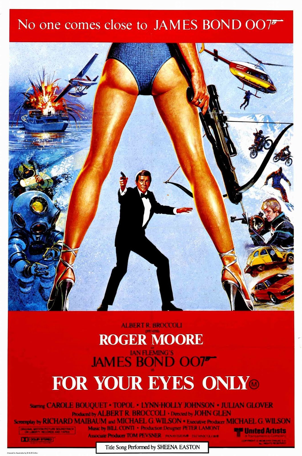
Denotations:
Bright yellow background with red writing
Says what type of film it is 'THE FIRST JAMES BOND FILM'
Has multiple semi-naked women on the poster as well as James Bond
Has Dr No in the corner of the poster
It has the actors name in a bold black font which catches your eye quickly and is easy to find when looking for
Connotations:
The fact that James Bond is bigger than the woman suggests that his is more powerful and that this film is sexist towards women. This could link to the fact that during the 1960's men were seen as more superior than women
I can recognise that this is a film poster however this is an old poster as it has poor quality images
The women get smaller as you go more towards the right which could suggest that their roles are less important as you got down
As you look from right to left the women seem to take their clothes off as they get closer to where James is and could be seen as an object
His clothing is very formal which shows his status
The minimal clothing could be shocking to the audience during the 1960's
The fact that Dr No is in black and white and only half on the poster could suggest mystery
The comic themed style used on the poster could suggest the action theme in the film especially with the gun smoking which could suggest that he has just shot someone or something
HYPOTHESIS:
"The products constructed to market James Bond films are designed to offer a clear appeal to a wide global audience of young males 17-35"
I agree with this hypothesis as James Bond over the years has been seen as a role model and someone to look up to and the use of attractive young females could attract a primarily male based audience. In this poster for "For your eyes only" (1981) they use a slim woman with her legs open to attract the male audience. It also has a slight show of her bum cheeks which could a link to the sexual theme within the James Bond franchise. However in the "Spectre" (2015) poster they still use an attractive woman on the cover yet she is covered up and may not be seen as a desire item as much as the other women on the front of a James Bond poster. Another thing in which could attract a young male audience would be the fact that James Bond is a spy movie where a lot of action happens and gun use. On every James Bond poster they include an image of him holding a gun which definitely represents a more based audience than female. The posters that they use can be controversial as they use woman as a desire item to make males more attracted to not just the film but also them. Although this hypothesis can be proven wrong. James Bond could attract females as he is a powerful and mysterious man and women love to tame a man. When Daniel Craig first made his appearance as the new James Bond in 'Casino Royale' and was instantly seen as a piece of 'eye candy' for female viewers. You could argue that throughout the franchise that any James Bond actor would be seen attractive to the female audience however Daniel Craig seems to be the most attractive James Bond so far. Overall I agree with the hypothesis in that James Bond is designed to offer a clear appeal to an audience of young males 17-35.


Monday 8th October 2018
L/O: To explore the idea of semiotics and how it can be applied to media analysis

LOOP TASK:
Denotations:
Dark colours with a bright orange in the background
Can see 3 figures- James Bond, a female and a masked man
Dressed smartly
Gun still is shown but not as much as it has been seen in other posters
Connotations:
The semiotics of the gun can link to the idea of death and violence which could relate to the skull as well
Dark colours with the orange connote death
His suit can link to his class and can also make him look a lot more masculine
Facial expressions are serious which could link to the seriousness of the film
The women is wearing a long dress which could suggest her status is high
They don't actually say that it is a James Bond film but only uses the 007 reference to tell us its a James Bond film
The name spectre is another word for a ghost which can casually connect to the skull mask. The Skull mask can connote the whole day of the dead theme which is the opening theme to this film
Semiotics:
The study of signs and symbols and their use of interpretation (the SIGNIFIER & the SIGNIFIED)
Signifier is the physical form, the thing that is being considered
Signified is what our culture has decided this form means
Saussure first put forward the idea that signs are compromised of 2 elements
(theory) ROLAND BATHES:
His theory focuses on how signs and images represent different cultures and ideologies in different way. These are established through DENOTATION AND CONNOTATION
(theory) CHARLES PEIRCE:
Focused on developing the idea that there were different levels of meaning that could be attached to signs and that these operated in different ways to audience.


Wednesday 10th October 2018
L/O: To apply semiotic theories when creating media products
Clothing brand aimed at young adults:

I decided to go with this brand name and logo as it is youthful, colourful and fits the theme of a skater brand which teenagers and young adults seem to be wearing more often these days. The font type gives off a skater vibe as it is handwritten and untidy which could connote to a teenage boy who is a bit rebellious. I wanted to include a small icon too as this could be recognised without the name next to it. I feel that the blue makes the logo stand out and can represent both boys and girls.
TV channel aimed at children aged at 6-11 year olds:

This is my logo and TV channel name for 6-11 year old children. I feel that the colouring and small image link to a young audience as well as a recognisable logo. It is easy to read for young children yet still is mature for 11 year olds +. I do however wish that I had made the colouring more visible as some people may not be able to see the yellow text on a red background. The colours are analogous so they are next to each other on the colour wheel.
Social media app aimed at 25-35 year olds:

This is my logo and social media app for 25-35 year olds. I wanted to keep the name short and catchy yet have some meaning for why I have done it. The B is pronounced separately so it sounds like you're saying be social. I have included a chat sign for an a which gives it a quirky and distinct logo. I have used mature colours which reflect the target audience yet they stand out well when placed on top of each other. These two colour are contrasting and complimentary colours.
Monday 29th October
L/O: To apply semiotic theories when analysing media texts
Conventions: a way in which something is usually done

Denotations:
Black and white image
Rita Ora is the model
Connotations:
Serious face
Typical colours for the adidas logo (blue and white) this helps to let the audience know what this poster is advertising. The famous the stripes is used too.
Audience:
The audience would be aimed at a young group as they will recognise not only Rita Ora but the famous 3 stripes that adidas use on their shoes and some clothing items. However aimed at both a male and female audience.
Context:
I know it is to advertise a new line in adidas superstars however I know that a lot of people wouldn't know what this poster is for.

How has it used conventional ideas of marketing?
It has used typical colours of lager brands which fits the theme of the type of product well. It also links to the Lord of the Rings as it looks mystical and shows off the fantasy theme of the film. It also includes traditional themes like including the bottle and also some condensation on the bottle to show freshness and to make the drink look more refreshing.
Who is it aimed at and how do you know this?
This advertisement would be aimed at an older target audience as they are old enough to drink this brand of lager and would more likely understand the lord of the rings theme more than a young adult would.
What assumptions are being made about the audience?
The designer of this poster assumed that the audience would get the lord of the rings reference when that isn't the case in some circumstances.
Wednesday 7th November 2018
L/O: To explore the concept of conventions and subversion

Denotations:
Green background
8 green bottles
Connotations:
We are unsure why they don't represent gender on the poster as the bottle in the middle is naked which could imply that it is a stripper
Conventions:
Green because it is a lager advert
The condensation on the bottle shows freshness
Audience:
Aged at 18 year olds plus as it is an alcoholic drink
Context:
Cadbury advert: https://www.youtube.com/watch?v=NHtEyDrD4oA
What does the advert tell us about cadbury?
That it is okay to be different and also to do your own thing. The slogan links to the fact that the gorilla is having a joyful time when playing the drums. The slogan can mean that if you eat the chocolate will make you feel joyful as well
What was the intention of the advert as it was so clearly different to typical confectionary adverts?
They made this advert to draw attention to the product/company. This can link back to why there was a 10% increase in sales because of the new buyers
Who is it aimed at?
An older audience as they will know the famous Phil Collins song 'in the air tonight"
What impact does it have on you?
It sticks into the audience's head as it is a catchy song
It boosted sales for the brand by 10%- why?
Because it was so different it made people go and buy the product
BENETTON ADVERTS

HOMEWORK: Analyse how this advert has been constructed and what meaning it is intended to convey. Explain why you think it was banned.
The advert has been constructed to make the public aware of the serious illness and pain caused by AIDS. However it raised the wrong type of response that the company Benetton wanted. Eventually the poster got removed from everywhere and got banned. I feel that the message that Benetton was trying to get across was to raise awareness to people who may not know what it is like for, not just an AIDS victim but, for their families too. For a younger audience, myself included, the photo can be a distressing photo and could also be seen as though Benetton is promoting AIDS along with their brand. Benetton have been known for their different adverts which managed to increase their sales by a huge 10% and over the years we can see that other adverts have broken the stereotype of a traditional advert for that particular brand. It almost has become a convention to be different and all of the Benetton adverts follow this different trend on promoting clothes. Overall I feel that this advert is intended to raise awareness on AIDS however it is very upsetting and distressing for any age group.

Old Spice. Old Spice is an American brand of male grooming products encompassing deodorants and antiperspirants, shampoos, body washes, and soaps. It is manufactured by Procter & Gamble. Today Old Spice is one of the most popular deodorant and body wash brands for men of all ages, but that wasn’t always the case. On the shelves since 1938, Old Spice had long been associated with the past and elderly gentlemen (I know that the first thing that came to mind whenever I smelled original Old Spice was my grandfather). However, in 2008 all of that changed. Old Spice and Wieden + Kennedy kicked off a new campaign, Old Spice Swagger, and completely transformed the face of the Old Spice brand, as well as their customers. The Old Spice Swagger campaign, which was the 2010 Silver Effie Winner, kicked off in 2008 when Old Spice realized they had to pick up their game if they wanted to compete with new younger men’s products, specifically Axe. When Axe entered the scene they turned the industry on its head – instead of focusing on the effectiveness of their product as an odor blocker, Axe promoted themselves as the product to buy if you want to attract the ladies. Old Spice, who had been standing by their 1-800-PROVE-IT campaign (try it and if you don’t like it, just call 1-800-PROVE-IT and we’ll buy you a stick of yours!), bit the dust. By changing their campaign and ad design it has enabled the brand 'old spice' to get a new young customers which they wanted to do. This may be because they want heir brand to be trendy, cool and modern. In the 1970s and 80s, Old Spice ad campaigns in the United Kingdom and Ireland featured a man on a surfboard accompanied by the strains of composer Carl Orff's O Fortuna from Carmina Burana, with the tagline "Old Spice - The Mark Of A Man." During 1970 the audience was positioned for a father or grandfather. This may have been due to the slogan being 'mark of a man'. During 1980 the audience changed to being very family orientated fitting in with the father and children with the slogan 'mark of an ultimate man'. And in 2013/2014 a young demographic became the face for Old Spice with the slogan 'smell like a man'.

The slogan "Lucozade aids recovery" was replaced by "Lucozade replaces lost energy". The glass bottle was replaced by a plastic (polyethylene terephthalate, PET) one. ... In 2013 GSK put Ribena and Lucozadeup for sale. Suntory, a Japanese holding company, bought the brands in September for £1.35 billion. Whilst Lucozade's image may have changed since 1927, Lucozade has remained a trusted brand that people have relied on for times when they need energy. Constantly testing and developing new ways to help people with their energy and performance needs, Lucozade is an innovator within its field and aims to continue to be so. Lucozade is a bold and dynamic brand, with an independence of spirit, a 'can-do' attitude and a 'never-say-die' approach to life, which is coupled with its rich heritage in health, and convalescence. As a result, consumers have a warmth of feeling for the brand not typically associated with the energy drink category. Ultimately consumers talk about the Lucozade 'magic': an indefinable quality that sums up Lucozade's taste, thickness and its ability to deliver energy when you need it. It launches with ambassador Bale a hot topic in the sports world, with reports linking the Tottenham Hotspur star with a record £85m transfer to Spanish club Real Madrid. Both Bale and Oxlade-Chamberlain are being used in the campaign to support the claim that Lucozade Sport helps sports participants across theUK to improve their endurance performance, by drinking the soft drink instead of water before and during matches. By using such a huge football star as the face of lucozade can attract any audience as he is a world famous man. Within the cold drinks market, increases in the soft drinks category have been slowing. However, growth has been driven considerably by the Energy drink sector, which was worth an estimated £940 million in 2003 and has grown +26% since 2001. (Source: Mintel Energy & Stimulant drinks Market Report August 2003). The energy drink category continues to grow at pace with brand extensions and new entrants to the market emerging every year. This represents both a challenge and an opportunity for the category's leading brands.

Shelter's core problem was that, as a famous UK based charity that had fought for decades to get the homeless off the streets, they had largely succeeded in their original task. They were now concentrating their efforts on the issue of the million or so people in the UK living in housing that was simply unfit for human habitation. Shelter has three core values that drive all our work:
WE'RE APPROACHABLE: Shelter is a lifeline for anyone who is homeless or suffering in bad housing. If you’re faced with losing your home, we’ll do everything we can to help you keep a secure roof over your head. Face-to-face, on the phone and by email, we’re committed to giving expert, confidential advice and support, tailored to the individual.
BENETTON ADVERTS

HOMEWORK: Analyse how this advert has been constructed and what meaning it is intended to convey. Explain why you think it was banned.
The advert has been constructed to make the public aware of the serious illness and pain caused by AIDS. However it raised the wrong type of response that the company Benetton wanted. Eventually the poster got removed from everywhere and got banned. I feel that the message that Benetton was trying to get across was to raise awareness to people who may not know what it is like for, not just an AIDS victim but, for their families too. For a younger audience, myself included, the photo can be a distressing photo and could also be seen as though Benetton is promoting AIDS along with their brand. Benetton have been known for their different adverts which managed to increase their sales by a huge 10% and over the years we can see that other adverts have broken the stereotype of a traditional advert for that particular brand. It almost has become a convention to be different and all of the Benetton adverts follow this different trend on promoting clothes. Overall I feel that this advert is intended to raise awareness on AIDS however it is very upsetting and distressing for any age group.
Monday 12th November 2018
L/O: To explore set advertising texts and research brands
loop task:
https://www.youtube.com/watch?v=l1vnsqbnAkk
https://www.youtube.com/watch?v=DpPBXiat2Xc
The 1996 barbie ad gives younger children the impression that you have to play with the mermaid doll as a mermaid however the 2018 advert lets girls play with their dolls however they want to play with them. It also says how girls can be whatever they want to be no matter what gender they are which plays in part with todays society ideas and movements.
Media language for print ads:
- Locations
- Costumes
- Props
- Makeup
- Lighting
- Choice of camera shot
- Camera angle
- Typography
- Layout
- Address of written content to the audience
- Colour
SET TEXTS:

Old Spice. Old Spice is an American brand of male grooming products encompassing deodorants and antiperspirants, shampoos, body washes, and soaps. It is manufactured by Procter & Gamble. Today Old Spice is one of the most popular deodorant and body wash brands for men of all ages, but that wasn’t always the case. On the shelves since 1938, Old Spice had long been associated with the past and elderly gentlemen (I know that the first thing that came to mind whenever I smelled original Old Spice was my grandfather). However, in 2008 all of that changed. Old Spice and Wieden + Kennedy kicked off a new campaign, Old Spice Swagger, and completely transformed the face of the Old Spice brand, as well as their customers. The Old Spice Swagger campaign, which was the 2010 Silver Effie Winner, kicked off in 2008 when Old Spice realized they had to pick up their game if they wanted to compete with new younger men’s products, specifically Axe. When Axe entered the scene they turned the industry on its head – instead of focusing on the effectiveness of their product as an odor blocker, Axe promoted themselves as the product to buy if you want to attract the ladies. Old Spice, who had been standing by their 1-800-PROVE-IT campaign (try it and if you don’t like it, just call 1-800-PROVE-IT and we’ll buy you a stick of yours!), bit the dust. By changing their campaign and ad design it has enabled the brand 'old spice' to get a new young customers which they wanted to do. This may be because they want heir brand to be trendy, cool and modern. In the 1970s and 80s, Old Spice ad campaigns in the United Kingdom and Ireland featured a man on a surfboard accompanied by the strains of composer Carl Orff's O Fortuna from Carmina Burana, with the tagline "Old Spice - The Mark Of A Man." During 1970 the audience was positioned for a father or grandfather. This may have been due to the slogan being 'mark of a man'. During 1980 the audience changed to being very family orientated fitting in with the father and children with the slogan 'mark of an ultimate man'. And in 2013/2014 a young demographic became the face for Old Spice with the slogan 'smell like a man'.

The slogan "Lucozade aids recovery" was replaced by "Lucozade replaces lost energy". The glass bottle was replaced by a plastic (polyethylene terephthalate, PET) one. ... In 2013 GSK put Ribena and Lucozadeup for sale. Suntory, a Japanese holding company, bought the brands in September for £1.35 billion. Whilst Lucozade's image may have changed since 1927, Lucozade has remained a trusted brand that people have relied on for times when they need energy. Constantly testing and developing new ways to help people with their energy and performance needs, Lucozade is an innovator within its field and aims to continue to be so. Lucozade is a bold and dynamic brand, with an independence of spirit, a 'can-do' attitude and a 'never-say-die' approach to life, which is coupled with its rich heritage in health, and convalescence. As a result, consumers have a warmth of feeling for the brand not typically associated with the energy drink category. Ultimately consumers talk about the Lucozade 'magic': an indefinable quality that sums up Lucozade's taste, thickness and its ability to deliver energy when you need it. It launches with ambassador Bale a hot topic in the sports world, with reports linking the Tottenham Hotspur star with a record £85m transfer to Spanish club Real Madrid. Both Bale and Oxlade-Chamberlain are being used in the campaign to support the claim that Lucozade Sport helps sports participants across the

Shelter's core problem was that, as a famous UK based charity that had fought for decades to get the homeless off the streets, they had largely succeeded in their original task. They were now concentrating their efforts on the issue of the million or so people in the UK living in housing that was simply unfit for human habitation. Shelter has three core values that drive all our work:
WE'RE APPROACHABLE: Shelter is a lifeline for anyone who is homeless or suffering in bad housing. If you’re faced with losing your home, we’ll do everything we can to help you keep a secure roof over your head. Face-to-face, on the phone and by email, we’re committed to giving expert, confidential advice and support, tailored to the individual.
WE CHALLENGE: Home is a basic human need. In our affluent nation, everyone should have a home, and Shelter is challenging the people in power to make that vision a reality, through tenacious lobbying, persuasive research and policy reports, and high-profile public campaigns. Shelter is fighting injustice, and righting housing wrongs – and we’re achieving real, positive changes that will benefit generations to come.
WE'RE ENTERPRISING: Shelter strives to get the most out of every penny it spends. We’re proud to join forces with like-minded organisations, to share our ideas, and develop creative ways of tackling housing need.
Shelter believes that everybody needs a home in a place they can thrive. Our work won’t stop until there’s a home for everyone. Home is a basic human need. In our affluent nation, everyone should have a home, and Shelter is challenging the people in power to make that vision a reality, through tenacious lobbying, persuasive research and policy reports, and high-profile public campaigns. Shelter is fighting injustice, and righting housing wrongs – and we’re achieving real, positive changes that will benefit generations to come.
Preferred:
When releasing this ad they would want the public and their audience to see and understand their ad. The audience who understand would be of a younger age as old Spice ads don't like to take their brand too seriously.
Negotiated:
The public may see this and assume that you will smell like the Bahamas which is what they kind of say in their ad. People may also not understand the tropical theme as they might not know where the Bahamas is.
Oppositional Readings:
Some people may see this ad and assume that it is for a drink and not for a deodorant
Who is the target audience? Primary and Secondary. Be as specific as possible.
I think that the target audience is aimed at both males and females. It is aimed at males because the product is a male body wash. However, it is primarily aimed at females too to buy it for their husband, boyfriend or partner as it was shown that females bought a female body wash product for males. So by having this male body wash it made women buy this product instead of a generic female body wash.
CHALLENGE: Use PSYCHOGRAPHICS
People would automatically assume that this advert and brand would be aimed at a younger audience as it doesn't take itself too seriously. What they didn't know in the past was that a mainly older audience bought their products but old spice wanted to change that.
Who is the star vehicle and what connotations would the audience take from them being used?
The star vehicle is Isaiah Amir Mustafa. For an American campaign he is popular with this type of audience and wis well known. He also is known for his footballing abilities.
What advertising conventions are used or subverted and what are the connotations of the different elements of media language used? (Colour/Font/Signs/Slogan/Image)
Some advertising conventions are used are how there is a lot going on in one picture which makes people look more into it in detail. It also fits nicely into the tv advert and how he speaks so quickly and crams a lot into a 30 second ad. The slogan also a has brief description about the deodorant and also includes a play on words; 'This fact has not been fact-checked'.
CHALLENGE: Link to IDEOLOGY
How is the product represented and why will this appeal to the different sections of the target audience?
The product is represented by a well known american footballer Isaiah Amir Mustafa. This will appeal to different sections of the audience as mainly males would know who this figure is but the product itself would maybe attract more of a female audience as they would buy the items for their husbands.
CHALLENGE: Link to IDEOLOGY/SOCIAL OR CULTURAL TEXT
How is the brand represented and why will this appeal to the different sections of the target audience?
The brand is represented by a primarily female audience and by having the star vehicle Isaiah Amir Mustafa would attract a female audience. Arguably it could attract a male audience too as the product is a males product and they would know who the star vehicle is. This is why its ranges from a wide audience and reaches out to different sections of the target audience.
CHALLENGE: Link to IDEOLOGY/SOCIAL OR CULTURAL TEXT
Preferred:
The public would see this advert as being primarily aimed at males due to the star vehicle, Gareth Bale
Negotiating:
That the audience may assume that if you drink this drink that you have to be a sporty person. People could also
Oppositional reading:
Audiences who aren't sporty may not get what the purpose of the advert is
Who is the target audience? Primary and Secondary. Be as specific as possible.
The target audience for this advert would be males. This would include both younger males and older. The reasoning behind this would be due to the star vehicle on the poster. Females may not know who he is so this advert would may not appeal to a female audience. Both a young and older male audience would know who this is or at least would recognise him from his footballing abilities.
CHALLENGE: Use PSYCHOGRAPHICS
Who is the star vehicle and what connotations would the audience take from them being used?
Gareth Bale is a famous footballer and this would link to the type of audience who would then go and buy the drink. The connotations people would take from this advert would be that it is aimed at males as they would know who it is. By having a sportsman like Gareth Bale would make people think that buying that particular drink would make them sporty just like Gareth Bale. By having him on this poster during the time it was released was around the time when he broke the record for the most expensive transfer.
What advertising conventions are used or subverted and what are the connotations of the different elements of media language used? (Colour/Font/Signs/Slogan/Image)
The poster colours (blue and yellow) link to the colouring of the orange lucozade orange bottle. The colours yellow and blue are corresponding colours. By using the yellow it is associated with energy and happiness which is what any sports drink wants to reflect. The blue colour connotes trust as well as confidence which contrasts the yellow connotations well. The font style is bold and easy to read as it isn't complicated or anything. The slogan links with a sport theme; 'from a different league' as footballers play in leagues.
CHALLENGE: Link to IDEOLOGY
How is the product represented and why will this appeal to the different sections of the target audience?
The product is represented by a sports personality. This is a good way to get across the fact that this drink is a sports drink. By having a footballer like Gareth Bale on the front of this type of poster can involve a wider range of audiences. This can link to a younger male audience to an older audience.
CHALLENGE: Link to IDEOLOGY/SOCIAL OR CULTURAL TEXT
How is the brand represented and why will this appeal to the different sections of the target audience?
Lucozade Sport is an iconic sports drink that helps boost performance when consumed before, during and after sport. As a crucial part of sporting preparation, Lucozade Sport comes in a number of flavours. The brand represents a sporty audience among all genders however, in this poster it attracts a more male audience based on the use of footballer Gareth Bale.
CHALLENGE: Link to IDEOLOGY/SOCIAL OR CULTURAL TEXT
Preferred:
Negotiating:
Oppositional reading:
Who is the target audience? Primary and Secondary. Be as specific as possible.
The target audience would be aimed at both males and females of an older age. This would be because of the fact that an older audience would more likely to be homeless due to a loss of a job or an eviction which wouldn't happen to a younger child on their own. This can be aimed at the already homeless or someone who is about to be.
CHALLENGE: Use PSYCHOGRAPHICS
What advertising conventions are used or subverted and what are the connotations of the different elements of media language used? (Colour/Font/Signs/Slogan/Image).
Some advertising conventions used is that they had used normal everyday peoples faces close up which shoes that homelessness can happen to anyone. The red creates an alert and also connotes power and determination. The bold font stands out even though it doesn't have full opacity. By having the bits of text over their face makes the audience think, when reading, about being homeless or being evicted.
CHALLENGE: Link to IDEOLOGY
How is the product represented and why will this appeal to the different sections of the target audience?
By having everyday people on the front cover of this poster can make the audience question whether it could be them who becomes homeless. What this poster is supposed to show is that shelter are here to help in any situation whether it is financial or due to illness.
CHALLENGE: Link to IDEOLOGY/SOCIAL OR CULTURAL TEXT
How is the brand represented and why will this appeal to the different sections of the target audience?
The brand is represented by everyday people who would maybe experience a loss of money or may have fallen ill and could result in loosing their home or personal belongings. By having normal people on the front of this poster takes the glam element out of this add and leaves it with the scary reality that you don't plan to lose your house or job and that shelter is here to help you at any point.
CHALLENGE: Link to IDEOLOGY/SOCIAL OR CULTURAL TEXT
L/O: To analyse the representations within set advertising texts
Stereotypes:


Shelter believes that everybody needs a home in a place they can thrive. Our work won’t stop until there’s a home for everyone. Home is a basic human need. In our affluent nation, everyone should have a home, and Shelter is challenging the people in power to make that vision a reality, through tenacious lobbying, persuasive research and policy reports, and high-profile public campaigns. Shelter is fighting injustice, and righting housing wrongs – and we’re achieving real, positive changes that will benefit generations to come.
Wednesday 14th November 2018
L/O: To analyse set advertising texts using audience theory
Audience theories:
The hypodermic needle theory-
- Developed in the 1920s and 30s
- Linear communication theory
- Passive audiences
- No individual difference
Cultural effects model-
The thinking behind this theory centres on the long term effects of particular ideological representations on our beliefs and values. Media representations of beautiful women have been influential in giving both men and women a view of the 'ideal women'.
The tow step flow-
- The hypodermic needle theory proposes that the media has a direct and powerful influence
- The two-step theory acknowledges communication is a more complex process
Gratification theory model-
Blumler and Katz said that there was four different reasons why audiences want to access media:
- Surveillance/ information
- Identity
- Relationships
- Diversion/ escapism
Reception theory-
The media producer encodes messages/ meaning in their product. There are three possible responses to that:
- The preferred or dominant reading from the audience
- Negotiated reading
- Oppositional reading. Where the audience get a completely different meaning to the product or they don't get it at all
Preferred:
When releasing this ad they would want the public and their audience to see and understand their ad. The audience who understand would be of a younger age as old Spice ads don't like to take their brand too seriously.
Negotiated:
The public may see this and assume that you will smell like the Bahamas which is what they kind of say in their ad. People may also not understand the tropical theme as they might not know where the Bahamas is.
Oppositional Readings:
Some people may see this ad and assume that it is for a drink and not for a deodorant
Who is the target audience? Primary and Secondary. Be as specific as possible.
I think that the target audience is aimed at both males and females. It is aimed at males because the product is a male body wash. However, it is primarily aimed at females too to buy it for their husband, boyfriend or partner as it was shown that females bought a female body wash product for males. So by having this male body wash it made women buy this product instead of a generic female body wash.
CHALLENGE: Use PSYCHOGRAPHICS
People would automatically assume that this advert and brand would be aimed at a younger audience as it doesn't take itself too seriously. What they didn't know in the past was that a mainly older audience bought their products but old spice wanted to change that.
Who is the star vehicle and what connotations would the audience take from them being used?
The star vehicle is Isaiah Amir Mustafa. For an American campaign he is popular with this type of audience and wis well known. He also is known for his footballing abilities.
What advertising conventions are used or subverted and what are the connotations of the different elements of media language used? (Colour/Font/Signs/Slogan/Image)
Some advertising conventions are used are how there is a lot going on in one picture which makes people look more into it in detail. It also fits nicely into the tv advert and how he speaks so quickly and crams a lot into a 30 second ad. The slogan also a has brief description about the deodorant and also includes a play on words; 'This fact has not been fact-checked'.
CHALLENGE: Link to IDEOLOGY
How is the product represented and why will this appeal to the different sections of the target audience?
The product is represented by a well known american footballer Isaiah Amir Mustafa. This will appeal to different sections of the audience as mainly males would know who this figure is but the product itself would maybe attract more of a female audience as they would buy the items for their husbands.
CHALLENGE: Link to IDEOLOGY/SOCIAL OR CULTURAL TEXT
How is the brand represented and why will this appeal to the different sections of the target audience?
The brand is represented by a primarily female audience and by having the star vehicle Isaiah Amir Mustafa would attract a female audience. Arguably it could attract a male audience too as the product is a males product and they would know who the star vehicle is. This is why its ranges from a wide audience and reaches out to different sections of the target audience.
CHALLENGE: Link to IDEOLOGY/SOCIAL OR CULTURAL TEXT
Preferred:
The public would see this advert as being primarily aimed at males due to the star vehicle, Gareth Bale
Negotiating:
That the audience may assume that if you drink this drink that you have to be a sporty person. People could also
Oppositional reading:
Audiences who aren't sporty may not get what the purpose of the advert is
Who is the target audience? Primary and Secondary. Be as specific as possible.
The target audience for this advert would be males. This would include both younger males and older. The reasoning behind this would be due to the star vehicle on the poster. Females may not know who he is so this advert would may not appeal to a female audience. Both a young and older male audience would know who this is or at least would recognise him from his footballing abilities.
CHALLENGE: Use PSYCHOGRAPHICS
Who is the star vehicle and what connotations would the audience take from them being used?
Gareth Bale is a famous footballer and this would link to the type of audience who would then go and buy the drink. The connotations people would take from this advert would be that it is aimed at males as they would know who it is. By having a sportsman like Gareth Bale would make people think that buying that particular drink would make them sporty just like Gareth Bale. By having him on this poster during the time it was released was around the time when he broke the record for the most expensive transfer.
What advertising conventions are used or subverted and what are the connotations of the different elements of media language used? (Colour/Font/Signs/Slogan/Image)
The poster colours (blue and yellow) link to the colouring of the orange lucozade orange bottle. The colours yellow and blue are corresponding colours. By using the yellow it is associated with energy and happiness which is what any sports drink wants to reflect. The blue colour connotes trust as well as confidence which contrasts the yellow connotations well. The font style is bold and easy to read as it isn't complicated or anything. The slogan links with a sport theme; 'from a different league' as footballers play in leagues.
CHALLENGE: Link to IDEOLOGY
How is the product represented and why will this appeal to the different sections of the target audience?
The product is represented by a sports personality. This is a good way to get across the fact that this drink is a sports drink. By having a footballer like Gareth Bale on the front of this type of poster can involve a wider range of audiences. This can link to a younger male audience to an older audience.
CHALLENGE: Link to IDEOLOGY/SOCIAL OR CULTURAL TEXT
How is the brand represented and why will this appeal to the different sections of the target audience?
Lucozade Sport is an iconic sports drink that helps boost performance when consumed before, during and after sport. As a crucial part of sporting preparation, Lucozade Sport comes in a number of flavours. The brand represents a sporty audience among all genders however, in this poster it attracts a more male audience based on the use of footballer Gareth Bale.
CHALLENGE: Link to IDEOLOGY/SOCIAL OR CULTURAL TEXT
Preferred:
Negotiating:
Oppositional reading:
Who is the target audience? Primary and Secondary. Be as specific as possible.
The target audience would be aimed at both males and females of an older age. This would be because of the fact that an older audience would more likely to be homeless due to a loss of a job or an eviction which wouldn't happen to a younger child on their own. This can be aimed at the already homeless or someone who is about to be.
CHALLENGE: Use PSYCHOGRAPHICS
What advertising conventions are used or subverted and what are the connotations of the different elements of media language used? (Colour/Font/Signs/Slogan/Image).
Some advertising conventions used is that they had used normal everyday peoples faces close up which shoes that homelessness can happen to anyone. The red creates an alert and also connotes power and determination. The bold font stands out even though it doesn't have full opacity. By having the bits of text over their face makes the audience think, when reading, about being homeless or being evicted.
CHALLENGE: Link to IDEOLOGY
How is the product represented and why will this appeal to the different sections of the target audience?
By having everyday people on the front cover of this poster can make the audience question whether it could be them who becomes homeless. What this poster is supposed to show is that shelter are here to help in any situation whether it is financial or due to illness.
CHALLENGE: Link to IDEOLOGY/SOCIAL OR CULTURAL TEXT
How is the brand represented and why will this appeal to the different sections of the target audience?
The brand is represented by everyday people who would maybe experience a loss of money or may have fallen ill and could result in loosing their home or personal belongings. By having normal people on the front of this poster takes the glam element out of this add and leaves it with the scary reality that you don't plan to lose your house or job and that shelter is here to help you at any point.
CHALLENGE: Link to IDEOLOGY/SOCIAL OR CULTURAL TEXT
Wednesday 26th November 2018
L/O: To analyse the representations within set advertising texts
Stereotypes:
- Age
- Gender
- Race
- Sexuality
- Nationality
- Disability
- The fact that they have included a male footballer for a sports drink
- How the captions on the 2 woman's faces make it seem like its their fault and the caption on the males face suggest that someone did this to him
- The masculine rolls in the old spice advert are being played to. You can see a male fishing and a woman sunbathing in the poster
Age:
- Babies and infants- Fragile, incapable of doing anything, crying, innocent
- Children and teens- Rebellious, disruptive, scary, uninformed, immature, active, lazy
- Young adults- Adventurous, lary, privileged, independent, depressed, organised
- Middle aged- Stressed out due to children or due to work, financially stable
- Elderly (60+)- Seen as very calm, slow, fragile, wise, rude, mature
(set texts):
- Shows that younger people get into financial issues more than any other age group would
- Using Gareth Bale engages a similar age group to how old he is
- The old spice shows a middle aged audience by the name "Old Spice" and due to the star vehicle
Race (set texts):
- There is an absence of the black race in the Shelter adverts
- The use of a white person on the Lucozade poster and not a black or Asian person which could suggest that a scientific fact is from a white person
- The use of having a black person as the face of "old Spice" could represent a typical funny black person or gangster like we typically see in TV shows and movies
Sexuality (set texts):
- Old spice assumes that the people they are aiming it at are heterosexual couples when actually it could be a gay couple instead
Nationality/ Regionality:
- South West- Surfers, inbred, farmers
- Irish- Drunk, comic characters, potatoes
- Welsh- Sheep shaggers, comic characters
- American- Fat, guns, black rights matter
(set texts):
- American values are represented in the ad by including a black American in the advert
Disability (set texts):
- In the shelter advert it could suggest that the people on the poster are financially disabled
- The dominant ideology for the luzocade and old spice adverts show that they are both abled bodied as they are both famous for their sporting works
Wednesday 28th November 2018
&
Wednesday 4th December 2018
&
Wednesday 4th December 2018
L/O: To review and apply context and representation to old spice advert
OLD SPICE:
"Become one of the freshest places on earth"- tagline for Old Spice.
The TV ad came out in 2010
Print ad (one of the set texts) came out in 2011
Was rebranded
3 print ads


How does the product use and subvert the conventional genre stereotypes of masculinity associated with adverts for such products and brands?
The product use typical conventional genre stereotypes of masculinity to help sell the product. For example in these three print adverts, Old Spice make the star vehicle topless to show off his muscles and have the camera shot as a mid angle to make him look bigger. The way that Isaiah Mustafa is smirking can show and suggest that the brand don't take themselves too seriously which we know from tv adverts as well as other print ads. It could also suggest that he is very confident in himself as well as the brand. One way in which the product subverts the traditional genre stereotypes of masculinity is that the dialogue in the taglines as well as the design on the print adverts with the different places around the world on his body and head. Even though it isn't like any other traditional advert it works really well as appeals to both men and women. Before the rebranding in 2010, most of the Old Spice adverts appealed to only men as they basically said "buy this product and you will have women all over you" when actually that wasn't true. After the rebranding they cater to both men and women and sales have increased by a huge 107%.
LUCOZADE:
Started off being called "Glucozade"
Often sold in chemists used a medicine
In the 70's it started to lose it's popularity due to the fact that people weren't falling as ill
1982 Lucozade repositioned their audience
They changed their slogan from "Aids recovery" to "Replaces lost energy"
In the 90's they introduced Lucozade sport (first brand to to launch with a sports sponsorship deal namely British Athletics and the FA Carling Premier
In 1998 they used Lara Croft. This involved a female audience as well as still maintaining a male audience
By 2013 Lucozade sport had established itself as the leading sports drink in the UK
Packaging has changed from glass bottles to pop top plastic ones
A change in colour shows a less unnatural product

Analyse: semiotics-
Blue colouring can be associated with depth and stability. It can symbolise confidence, loyalty as well as truth. The use of blue for the scientific facts can show that they must be true. The yellow can show intellect as well as energy. This can link well with the sports drink giving you lots of energy. The white text can symbolise cleanliness and safety which is what you want a brand to represent and strive upon. The black text on the first ad can be associated with a elegance and power. This links with the star vehicle as he is powerful.
The use of a sans serif font can link to a modern, young and stylish audience as well as the brand itself. By having the taglines in capital letters can show a masculine theme throughout the Lucozade adverts. This links well with the star vehicle as he is an attractive athletic male who is well known across the Uk and arguably across the world.
Design/layout is very traditional with the large main image of Gareth Bale who was very well known during the release time of this advert. The white frame makes him stand out even more against the light blue background. All the text around him can relate to scientific information. The bottle carries the slogan "#IBELIEVE".
The use of personal pronouns make the advert involve you and persuade you to buy the product.
The use of personal pronouns make the advert involve you and persuade you to buy the product.
The slogan is significant and is a big part in the campaign because it does imply that it benefits you when doing some sport. The use of # engages a wider range of audience being the young and old. It reflects the concerns of the era and shows that it is not an energy drink. The idea of the drink being more sports based made more sells as energy drinks with caffeine had a bad name in the press and Lucozade wanted to make sure that the public didn't see their sports drink as one of those.
How is the advert an example of changes in media representation of brands?
The advert is an example of change in the media representation of brands by its use of scientific knowledge and calling their drink a sports drink. This made the public see a non energy drink and more of one that they can trust because of their use of those "scientific" facts they have included in their campaign. From this campaign it changed a lot of the way that energy drinks advertised their drink. What they did was use famous athletes or used a sporting person to promote their energy drink. This #IBELIEVE campaign changed the way energy drink brands promote their product. This advert can tell us about changes in the media access and consumption by the way they sell the product in these adverts. It makes the audience believe that the drink is safe, healthy and "better than water".
Why have advertisers and marketeers moved to greater use of social media in their branding?
Advertisers and marketeers have moved to a greater use of social media in their branding because of the growing amount of users. By using social media to promote or sell their product it can allow companies to reach a wider audience range as well as be seen by millions if people per day. Lucozade has cleverly used a trending # to get their campaign talked about. By having a # it allows the brand to be shared about most social media platforms across the globe.
How does the product use conventional stereotypes associated with adverts for such products and brands?
Lucozade have used the conventional stereotype of masculinity in these tow particular adverts to help sell their product. Arguably the use of Gareth Bale helped sell the product better, due to his large platform he had during the release of this ad, also made him because the face of #IBELIEVE ad campaigns. What Lucozade also do by having such a big football player like Gareth Bale is give the public a healthy, fit and well looked after person to be the fcae of Lucozade. This could suggest that the product is scientifically proven to be "better than water" when actually we know its not. The first ad that was released with the slogan "hydrates and fuels you better than water" got banned shortly after being released due to the fact that we all know that water doesn't fuel pr hydrate you better than water. However, by having Bale the face of the campaign did male the public question whether it was due to the fact that he is a fit and healthy sportsman. The adverts colour palette signify the energy from the yellow and the trust in the blue. What it also does for us is that it symbolises confidence as well as happiness which Lucozade can imply if you drink this sports drink. The advantages of using an ad like this to sell their product separates them form the shamed previous energy drinks which had a bad name for themselves. By becoming the first brand to do this allowed trust within the public to let them know that this sports drink is healthier and that it is also scientifically proved that it is.
SHELTER:
Charity campaigns vs commercial products
Charity adverts are traditionally been different due to the fact that they can't throw away money on adverts unlike commercial ads can
All about raising awareness for everyday people about everyday circumstances
Charity adverts are all about creating a sense of shared values
Audiences can grow tired over charity adverts as there are only so many times you can be shocked when seeing an ad for the 17th time or so
Typical conventions:
Close up shot- audience positioned to see the empty gaze
Eyes stare out, direct address- Eye contact is a powerful point of identification
Washes out/ desaturated colour - drab/harsh life: realism
Direct address (imperative nouns)
Logo of the brand usually is respectable or well known

We can help campaign:
It has a very specific target audience
The three posters focus on unemployment or if in financial debt
These adverts weren't about getting people to donate money for their charity
All have the strap line " we can help"
They ran these ads in specific areas of the country to see if there was an impact
Previous campaigns:

How are these constructed in the advert? What is the appeal of the advert?
These adverts are constructed in specific ways to make the audience feel sympathy for the people in the ad as well as anyone else who it going through the same thing. What it also does is makes the public stop and think about what is happening in the world to make something like this happen. The appeal for the advert is not just to make people aware of the situation but to also make them donate to the charity and to let them know that SHELTER are here to help.
In what way does it represent the context of 2013?
In 2013 homelessness was a big issue as it still is today. By having adverts like this being realised around this time helped people who may loose their house as well as people who were already homeless. SHELTER didn't want their adverts to make people donate but instead wanted to make them aware of the situation happening and this can been seen today and not just in the year 2013.
How does it reference the brand identity of SHELTER from previous campaigns?
All 3 ads carry the same message, brand identity and logo. The colour palette is similar to previous campaigns and is heavy on the colour red. What it also does is reference similar quotes and the idea that it makes it personal to a particular person.
Homework: Explain how representations in advertising are chosen to help sell the product or brand. Refer to two of the adverts you have studied. (10)
Representations in advertising are chosen to help sell the product or brand by giving the audience typical conventions that can help them understand what that particular advert is about or who it is aimed at. For example the use of Gareth Bale invites a primarily young male audience in the Lucoazde adverts. In the Lucozade ads and Old Spice adverts they both include typical stereotypes which could arguably help to sell the product/ brand. In the old spice advert, representations such as the use of having a black person as the face of Old Spice could represent a typical funny black person or gangster like we typically see in TV shows and movies which ties in well with Old spice as the brand doesn't like to take themselves too seriously. What can be seen in both of my examples of adverts is that the dominant ideology for the Luzocade and old spice adverts show that they are both abled bodied as they are both famous for their sporting works. One negative thing about Old spice is that it assumes that the people they are aiming it at are heterosexual couples when actually it could be a gay couple instead that buy their product. Most representations used in advertisements are based on typical stereotypes. The fact that they have included a male footballer for a sports drink can be seen as a negative stereotype and the masculine rolls in the old spice advert are being played to. You can see a male fishing and a woman sunbathing in the poster. Even though many people disagree with these common stereotypes, without them products wouldn't sell. The use of a footballer as big as Gareth Bale helped sell the product and brand massively but also increased the amount of young males buying the product. This gives the target audience an appeal to buy the product due to the use of such a big footballer. By having him can make the product and company trustworthy because of Gareth Bale. The young target audience can be seen through the use of a '#'. The campaign that this particular ad came from was the #IBELIEVE and this '#' allowed a younger to get involved with the campaign via social media.
Lucozade is represented by a sports personality. This is a good way to get across the fact that this drink is a sports drink. By having a footballer like Gareth Bale on the front of this type of poster can involve a wider range of audiences. Lucozade have used the conventional stereotype of masculinity in this particular advert to help sell their product. What Lucozade also do by having such a big football player like Gareth Bale is give the public a healthy, fit and well looked after person to be the fcae of Lucozade. This could suggest that the product is scientifically proven to be "better than water" when actually we know its not. The advert is an example of change in the media representation of brands by its use of scientific knowledge and calling their drink a sports drink. This made the public see a non energy drink and more of one that they can trust because of their use of those "scientific" facts they have included in their campaign. Old Spice product use typical conventional genre stereotypes of masculinity to help sell the product. For example in the Old Spice campaign, "Smell Like A Man", make the star vehicle topless to show off his muscles and have the camera shot as a mid angle to make him look bigger. By doing this it helps signify who their audience actually is and can also be used to attract that particular audience. Even though it isn't like any other traditional advert it works really well as appeals to both men and women. Before the rebranding in 2010, most of the Old Spice adverts appealed to only men as they basically said "buy this product and you will have women all over you" when actually that wasn't true. After the rebranding they cater to both men and women and sales have increased by a huge 107%.
link to the specific target audiences and explain the appeals
How does the product use conventional stereotypes associated with adverts for such products and brands?
Lucozade have used the conventional stereotype of masculinity in these tow particular adverts to help sell their product. Arguably the use of Gareth Bale helped sell the product better, due to his large platform he had during the release of this ad, also made him because the face of #IBELIEVE ad campaigns. What Lucozade also do by having such a big football player like Gareth Bale is give the public a healthy, fit and well looked after person to be the fcae of Lucozade. This could suggest that the product is scientifically proven to be "better than water" when actually we know its not. The first ad that was released with the slogan "hydrates and fuels you better than water" got banned shortly after being released due to the fact that we all know that water doesn't fuel pr hydrate you better than water. However, by having Bale the face of the campaign did male the public question whether it was due to the fact that he is a fit and healthy sportsman. The adverts colour palette signify the energy from the yellow and the trust in the blue. What it also does for us is that it symbolises confidence as well as happiness which Lucozade can imply if you drink this sports drink. The advantages of using an ad like this to sell their product separates them form the shamed previous energy drinks which had a bad name for themselves. By becoming the first brand to do this allowed trust within the public to let them know that this sports drink is healthier and that it is also scientifically proved that it is.
SHELTER:
Charity campaigns vs commercial products
Charity adverts are traditionally been different due to the fact that they can't throw away money on adverts unlike commercial ads can
All about raising awareness for everyday people about everyday circumstances
Charity adverts are all about creating a sense of shared values
Audiences can grow tired over charity adverts as there are only so many times you can be shocked when seeing an ad for the 17th time or so
Typical conventions:
Close up shot- audience positioned to see the empty gaze
Eyes stare out, direct address- Eye contact is a powerful point of identification
Washes out/ desaturated colour - drab/harsh life: realism
Direct address (imperative nouns)
Logo of the brand usually is respectable or well known
We can help campaign:
It has a very specific target audience
The three posters focus on unemployment or if in financial debt
These adverts weren't about getting people to donate money for their charity
All have the strap line " we can help"
They ran these ads in specific areas of the country to see if there was an impact
Previous campaigns:

How are these constructed in the advert? What is the appeal of the advert?
These adverts are constructed in specific ways to make the audience feel sympathy for the people in the ad as well as anyone else who it going through the same thing. What it also does is makes the public stop and think about what is happening in the world to make something like this happen. The appeal for the advert is not just to make people aware of the situation but to also make them donate to the charity and to let them know that SHELTER are here to help.
In what way does it represent the context of 2013?
In 2013 homelessness was a big issue as it still is today. By having adverts like this being realised around this time helped people who may loose their house as well as people who were already homeless. SHELTER didn't want their adverts to make people donate but instead wanted to make them aware of the situation happening and this can been seen today and not just in the year 2013.
How does it reference the brand identity of SHELTER from previous campaigns?
All 3 ads carry the same message, brand identity and logo. The colour palette is similar to previous campaigns and is heavy on the colour red. What it also does is reference similar quotes and the idea that it makes it personal to a particular person.
Monday 10th December 2018
Representations in advertising are chosen to help sell the product or brand by giving the audience typical conventions that can help them understand what that particular advert is about or who it is aimed at. For example the use of Gareth Bale invites a primarily young male audience in the Lucoazde adverts. In the Lucozade ads and Old Spice adverts they both include typical stereotypes which could arguably help to sell the product/ brand. In the old spice advert, representations such as the use of having a black person as the face of Old Spice could represent a typical funny black person or gangster like we typically see in TV shows and movies which ties in well with Old spice as the brand doesn't like to take themselves too seriously. What can be seen in both of my examples of adverts is that the dominant ideology for the Luzocade and old spice adverts show that they are both abled bodied as they are both famous for their sporting works. One negative thing about Old spice is that it assumes that the people they are aiming it at are heterosexual couples when actually it could be a gay couple instead that buy their product. Most representations used in advertisements are based on typical stereotypes. The fact that they have included a male footballer for a sports drink can be seen as a negative stereotype and the masculine rolls in the old spice advert are being played to. You can see a male fishing and a woman sunbathing in the poster. Even though many people disagree with these common stereotypes, without them products wouldn't sell. The use of a footballer as big as Gareth Bale helped sell the product and brand massively but also increased the amount of young males buying the product. This gives the target audience an appeal to buy the product due to the use of such a big footballer. By having him can make the product and company trustworthy because of Gareth Bale. The young target audience can be seen through the use of a '#'. The campaign that this particular ad came from was the #IBELIEVE and this '#' allowed a younger to get involved with the campaign via social media.
Lucozade is represented by a sports personality. This is a good way to get across the fact that this drink is a sports drink. By having a footballer like Gareth Bale on the front of this type of poster can involve a wider range of audiences. Lucozade have used the conventional stereotype of masculinity in this particular advert to help sell their product. What Lucozade also do by having such a big football player like Gareth Bale is give the public a healthy, fit and well looked after person to be the fcae of Lucozade. This could suggest that the product is scientifically proven to be "better than water" when actually we know its not. The advert is an example of change in the media representation of brands by its use of scientific knowledge and calling their drink a sports drink. This made the public see a non energy drink and more of one that they can trust because of their use of those "scientific" facts they have included in their campaign. Old Spice product use typical conventional genre stereotypes of masculinity to help sell the product. For example in the Old Spice campaign, "Smell Like A Man", make the star vehicle topless to show off his muscles and have the camera shot as a mid angle to make him look bigger. By doing this it helps signify who their audience actually is and can also be used to attract that particular audience. Even though it isn't like any other traditional advert it works really well as appeals to both men and women. Before the rebranding in 2010, most of the Old Spice adverts appealed to only men as they basically said "buy this product and you will have women all over you" when actually that wasn't true. After the rebranding they cater to both men and women and sales have increased by a huge 107%.
link to the specific target audiences and explain the appeals
Wednesday 12th December 2018
L/O: To reflect and improve on exam style question
TARGETS-
LITERACY: Basics! Capital letters for products and brands
TERMINOLOGY: Make sure you know the names of all the elements of the adverts etc.
THEORY: Add in audience theory when relevant
TARGET AUDIENCE: Old Spice- Product vs Advert
ANALYSIS STRUCTURE: Answer general question first. Talk the different areas of representation within overall representations convey


Wed 26th Sep:
ReplyDeleteDIRT: good analysis. Try not to simply go for the 'it makes it stand out' comments!
3rd October:
ReplyDeleteWill Smith description - you need to describe the facial expression more specifically
Homework:
Well done - good start
DIRT: I like the way you look at both sides - make sure you decide on one conclusion overall
8th October: Analysis
Good understanding of semiotics.
DIRT: Good analysis but you're missing the semiotics terminology
10th October: Logos
Great start.
DIRT: please explain choices made - colour etc.
DIRT: Logos (please put DIRT in pink).
ReplyDeleteGood designs - you need to think about colour connotations more carefully and how images (shapes, signs, symbols) could represent the brand name more easily than the name itself.
Cadbury's Ad Analysis: lacks detail. Try to link to the brand image
ReplyDeleteBenetton Ad Analysis: another good overview, well linked to the social context. It was banned due to causing offence to a specific group of people.
Set Text Research: Good detailed research into the brands.
Set Text Analysis: Lucozade is a good analysis. Shelter is also a solid overview. Old Spice needs more work on the representation.
Social Context: Old Spice - good analysis but make sure you show you understand about the different campaigns we are discussing.
Social Context: Great notes and mini analysis of all three texts.
ReplyDeleteExam Practice: A good response that covers many areas of representation.
DIRT: link to the specific target audiences and explain the appeals